E-commerce UI UX Design

Lifetouch

Reducing Drop-Off with a Clear Path to “View My Photos”

UX Designer Q3 2020

Sketch, Google Analytics, Optimizely

Challenge:

Three Prestige sites caused confusion. Traffic landed on Schedule when users wanted to view or buy photos, driving high bounce and support calls.

Challenge:

Three Prestige sites caused confusion. Traffic landed on Schedule when users wanted to view or buy photos, driving high bounce and support calls.

Challenge:

Three Prestige sites caused confusion. Traffic landed on Schedule when users wanted to view or buy photos, driving high bounce and support calls.

Challenge:

Three Prestige sites caused confusion. Traffic landed on Schedule when users wanted to view or buy photos, driving high bounce and support calls.

Solution:

​​Research-led persistent banner redirect. Designed three copy variants for a bottom banner that routed shoppers to the correct site. A/B/n test validated.

Solution:

​​Research-led persistent banner redirect. Designed three copy variants for a bottom banner that routed shoppers to the correct site. A/B/n test validated.

Solution:

​​Research-led persistent banner redirect. Designed three copy variants for a bottom banner that routed shoppers to the correct site. A/B/n test validated.

Solution:

​​Research-led persistent banner redirect. Designed three copy variants for a bottom banner that routed shoppers to the correct site. A/B/n test validated.

Impact:

Reduced wrong-site confusion and established a low-lift redirect pattern adopted by the team.

Impact:

Reduced wrong-site confusion and established a low-lift redirect pattern adopted by the team.

Impact:

Reduced wrong-site confusion and established a low-lift redirect pattern adopted by the team.

Impact:

Reduced wrong-site confusion and established a low-lift redirect pattern adopted by the team.

Role:

Led research and UI design. Framed problem, wireframed, shipped responsive UI. Partnered with marketing, engineering. Delivered in two weeks.

Role:

Led research and UI design. Framed problem, wireframed, shipped responsive UI. Partnered with marketing, engineering. Delivered in two weeks.

Role:

Led research and UI design. Framed problem, wireframed, shipped responsive UI. Partnered with marketing, engineering. Delivered in two weeks.

Role:

Led research and UI design. Framed problem, wireframed, shipped responsive UI. Partnered with marketing, engineering. Delivered in two weeks.

+10%

Site Traffic

+50K

Revenue Increase

UX Research

UX Research

Experimentation

Experimentation

Conversion Optimization

Conversion Optimization

E-commerce UI UX Design

Top 5 wins for Prestige for the year!

Doug Cullen profile photo

Myles Mjolsnes

Senior Digital Product Manager at Lifetouch

Background and Context

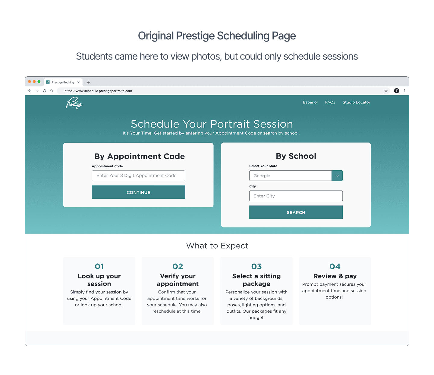
Prestige (a Lifetouch division) serves high-school seniors and parents across three sites:

  • Schedule: book a portrait session

  • Shop: claim proofs and purchase

  • Prestige (info): prep, FAQs, and links


Problem Framing

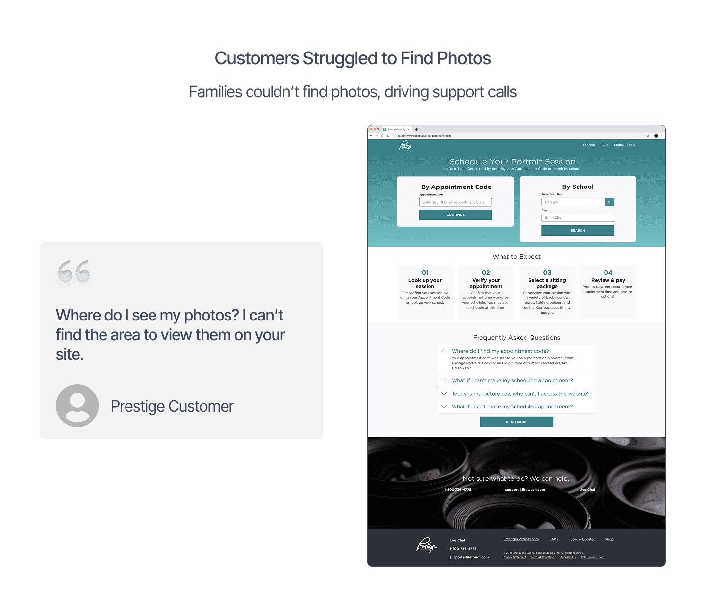
Traffic arrived on the wrong site for the “buy/view” task.

  • Page language emphasized scheduling, not shopping.

  • No persistent affordance to redirect shopping intent.

  • Support reported frequent “Where are my photos?” contacts.
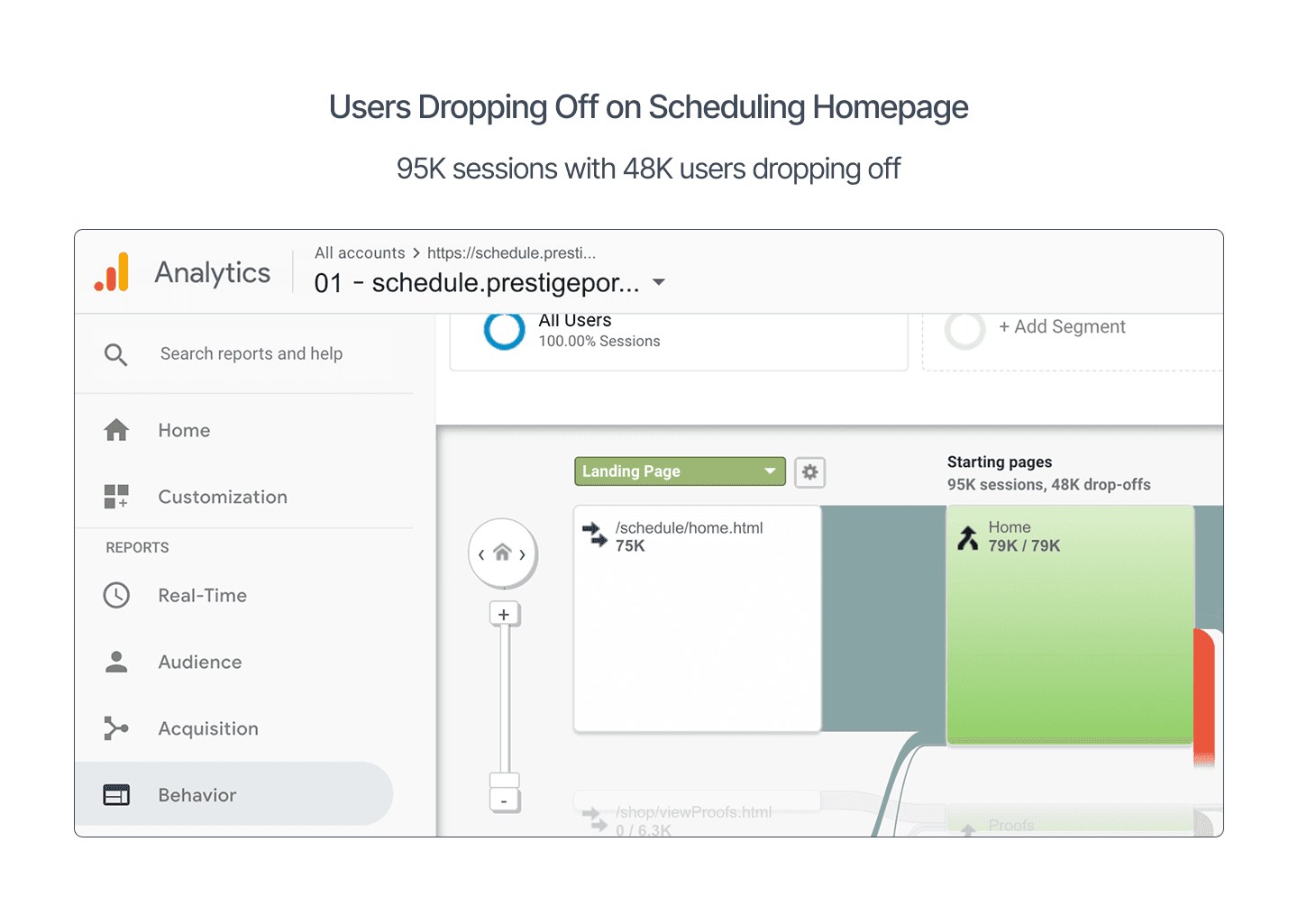
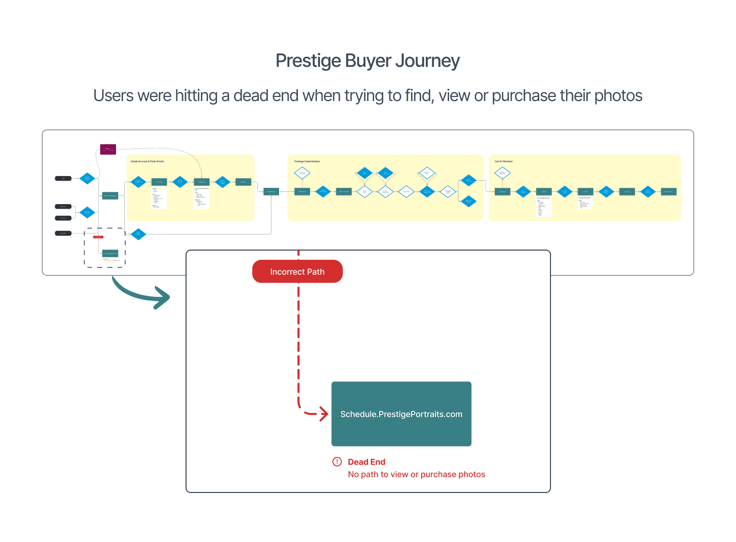

Design Approach

Principles

  • Mirror user language (“View my photos”), not internal terms (“Claim”).

  • Make the shop path obvious without breaking scheduling flow.

  • Ship a low-lift, brand-aligned pattern for mobile and desktop.

  • Validate quickly; measure real behavior.

What I did

  • Synthesized Google Analytics, Hotjar, and survey insights to define the redirect problem.

  • Sketched and produced low- to mid-fidelity banner options in Sketch.

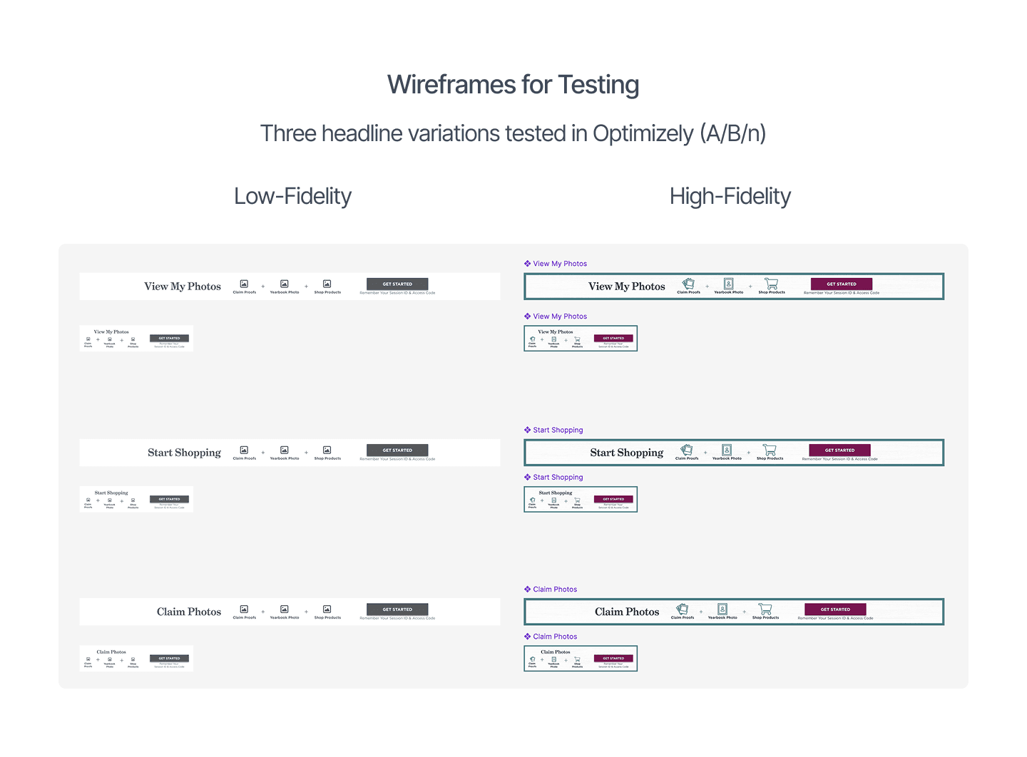
  • Wrote three headlines: View My Photos (intent), Start Shopping (task), Claim Photos (system term).

  • Designed mobile/desktop banners to the Prestige style guide.

  • Partnered with engineering to implement a sticky bottom banner on the Schedule site.

Experiment Design

  • A/B/n via Optimizely: three headline variations tested

  • Primary metric: click-throughs to the Shop site

  • Secondary: bounce reduction and downstream purchase KPIs

  • Ran multiple weeks; winner promoted to 100%

Final Designs

  • Persistent, dismissible bottom banner; unobtrusive for schedulers

  • Winning headline: View My Photos

  • Left: icons for Claim Proofs • Yearbook Photo • Shop Products

  • Right: Get Started CTA with “Session ID & Access Code” reminder

Responsive, accessible contrast, and targets

Outcome and Impact

  • Recognized internally as a Top 5 Prestige win for the year

  • Redirect pattern standardized for future use

Reflection

If I had more time, I would:

  • User language (“View my photos”) beat internal terminology (“Claim”).

  • A small, persistent affordance resolved a cross-site IA gap without a full redesign.

  • Next: unify navigation across the three sites, add a global “View My Photos” entry, and keep testing copy/placement.

Case Study

Read Other Case Study

Looking for a strategic
designer? Let’s connect

Mail Icon

marap844@gmail.com

© 2025

Mara Pederson, All Right Reserved

Looking for a strategic
designer? Let’s connect

Mail Icon

marap844@gmail.com

© 2025

Mara Pederson, All Right Reserved

Looking for a strategic
designer? Let’s connect

Mail Icon

marap844@gmail.com

© 2025

Mara Pederson, All Right Reserved

Looking for a strategic
designer? Let’s connect

Mail Icon

marap844@gmail.com

© 2025

Mara Pederson, All Right Reserved